- Retention of log lines per day in a stacked graph with categories for retention periods
- Restored data per day
- Ingested data v. retained data per day
- Trends in usage for the top 50 apps, sources, and tags
Retained Data
The Retained Data graph displays the volume and count of retained log lines per day for the selected time period. For each day, the graph also displays the volume and count of log lines retained for each type of retention period.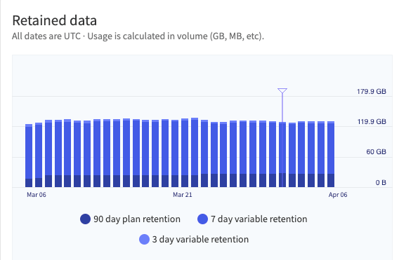
The Retained Data graph. The marker indicates the end and beginning of the billing cycle.
Restored Data
The Restored Data graph displays the volume of data restored per day for the selected time periodIngested v. Retained Data
The Ingested v. Retained Data graph displays the volume of ingested data v. retained data per day for the selected time period.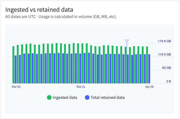
The Ingested v. Retained Data graph. The marker indicates the end and beginning of the billing cycle.
Stacked and Unstacked
Toggling Stacked to on, will stack the data lines on top of each other and display the sum of all visible sources. The graph will also be updated to show how each app, source, or tag compares to the total.Trends
The Trends graph displays the volume of data for the selected data type for the top Apps, Sources, and Tags. In the Stacked view, the graph will display the data lines on top of each other and display the sum of all visible sources. The graph will also be updated to show how each app, source, or tag compares to the total.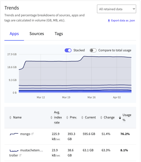
The Trends graph in the Stacked view.